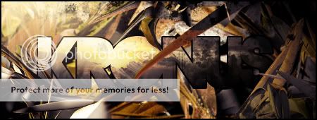
Hey guys,
Took me 3 hours ;D
-DT
Shout-Out
User Tag List
Thread: [Show-Off] Newest sig
Results 1 to 9 of 9
-
07-13-2009 #1ft. Aestysu


- Reputation
- 392
- Join Date
- Jun 2008
- Posts
- 1,160
- Thanks G/R
- 0/1
- Trade Feedback
- 0 (0%)
- Mentioned
- 0 Post(s)
- Tagged
- 0 Thread(s)
[Show-Off] Newest sig
We stand as one, to remember Mirror.
-
07-13-2009 #2Banned


- Reputation
- 136
- Join Date
- Jul 2007
- Posts
- 833
- Thanks G/R
- 0/0
- Trade Feedback
- 0 (0%)
- Mentioned
- 0 Post(s)
- Tagged
- 0 Thread(s)
oo la la, very nice +10 for epic
-
07-13-2009 #3Contributor
![[Kronus] is offline](https://www.ownedcore.com/forums/images/styles/OwnedCoreFX/statusicon/user-offline.png)

- Reputation
- 184
- Join Date
- Sep 2006
- Posts
- 459
- Thanks G/R
- 0/0
- Trade Feedback
- 0 (0%)
- Mentioned
- 0 Post(s)
- Tagged
- 0 Thread(s)
2 things.
Text and Light.
The text is somewhat unreadable and shouldn't have as much effects to it. And if you added a light source at the top right and some shadow at the bottom left area it would add realism and liking to the eye. Renders/stock like yours are good in that they have already chosen were the light source will be. For that signature you can definitely see the pale yellow lighting on the gun and the orange yellow on the back of the man. Try adding a 200 pxl soft brush of the color from the lighted area to the location where it would make sense.
Sorry for such the long post. I hope it helps.
Rating: if 10/10 is perfection
5-6(This is a very stricked rating I know. My expectations are extremely high )
)

-
07-13-2009 #4Banned

- Reputation
- 81
- Join Date
- Apr 2009
- Posts
- 694
- Thanks G/R
- 0/0
- Trade Feedback
- 0 (0%)
- Mentioned
- 0 Post(s)
- Tagged
- 0 Thread(s)
Looks good
 .
.
I do not like the text very much,
but it fits it perfect. Either way,
9.5/10.
-
07-13-2009 #5Member

- Reputation
- 10
- Join Date
- Jan 2007
- Posts
- 68
- Thanks G/R
- 0/0
- Trade Feedback
- 0 (0%)
- Mentioned
- 0 Post(s)
- Tagged
- 0 Thread(s)
Looks decent, I must agree the text is somewhat hard to read, otherwise its good looking 9/10
-
07-13-2009 #6Member

- Reputation
- 9
- Join Date
- Mar 2008
- Posts
- 68
- Thanks G/R
- 0/0
- Trade Feedback
- 0 (0%)
- Mentioned
- 0 Post(s)
- Tagged
- 0 Thread(s)
Ownage! Can you help me get into gfx?

-
07-13-2009 #7Banned

- Reputation
- 81
- Join Date
- Apr 2009
- Posts
- 694
- Thanks G/R
- 0/0
- Trade Feedback
- 0 (0%)
- Mentioned
- 0 Post(s)
- Tagged
- 0 Thread(s)
Dude, just take tutorials. Learn the basics.
We mostly all taught ourselves.
-
07-13-2009 #8ft. Aestysu


- Reputation
- 392
- Join Date
- Jun 2008
- Posts
- 1,160
- Thanks G/R
- 0/1
- Trade Feedback
- 0 (0%)
- Mentioned
- 0 Post(s)
- Tagged
- 0 Thread(s)
-
07-13-2009 #9Banned

- Reputation
- 81
- Join Date
- Apr 2009
- Posts
- 694
- Thanks G/R
- 0/0
- Trade Feedback
- 0 (0%)
- Mentioned
- 0 Post(s)
- Tagged
- 0 Thread(s)
Yes that is a really good book. You can also check out
some tutorials around google, also very helpful.
Similar Threads
-
[Show-Off] Newest Sigs
By Redfalcon in forum Art & Graphic DesignReplies: 12Last Post: 08-02-2008, 09:36 AM -
[Show-off] Newest Sigs
By klamor in forum Art & Graphic DesignReplies: 3Last Post: 04-10-2008, 06:53 AM -
[Show-off] My sigs, pls give feedback ;)
By mchugh in forum Art & Graphic DesignReplies: 13Last Post: 12-24-2007, 05:49 AM -
[Show-Off]Link Sig
By Strife117 in forum Art & Graphic DesignReplies: 0Last Post: 12-13-2007, 09:04 PM -
Show Off Ur Sig Skills
By fasck in forum Community ChatReplies: 9Last Post: 08-09-2006, 04:23 PM
![[Show-Off] Newest sig](https://www.ownedcore.com/forums/images/styles/OwnedCoreFX/addimg/menu4.svg)

![[Show-Off] Newest sig](https://www.ownedcore.com/forums/./ocpbanners/1/2/9/8/0/2/2/01d9781faec8bfe3abf9095ac9e57d1e.jpg)
![TradeSafe Middleman [Show-Off] Newest sig](https://www.ownedcore.com/assets/mm/images/wits.png)
![CoreCoins [Show-Off] Newest sig](https://www.ownedcore.com/forums/images/styles/OwnedCoreFX/addimg/wicc.png)


 Reply With Quote
![[Show-Off] Newest sig](https://www.ownedcore.com/images/ba/g/b2.gif)


![[Show-Off] Newest sig](https://www.ownedcore.com/images/paybutton/paypal.png)
![[Show-Off] Newest sig](https://www.ownedcore.com/images/paybutton/skrill.png)
![[Show-Off] Newest sig](https://www.ownedcore.com/images/paybutton/payop.png)