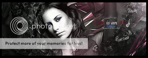
Ok, so here's a storyline (you could say that) of my achievements.. lol
First one i ever made was this
Then i went on to make
(had a view different versions of it but i like that one the best)
then i made this one, which i recon was pretty good for me at the time.
Then someone dedicated a signature to me, and i added the moving part on this signature, first time i ever tried to make it.
After that i stopped for about a year
About a month or so ago i made this one which didn't turn out how would of liked it to
then i made this three weeks ago
[Version 1]
[Version 2]
i like version 2 better then version 1.
Since then i've been trying to make signatures from tutorials that involve C4D's but they turnt out really bad.. so i never saved them lol
I made this one just the other day, didn't turn out how i liked but it looks alright, i'm gonna end up trying more signatures with the same style as the one below

Any comments?
EDIT:
Added 2/3 more signatures
First one (Yes i know how bright this is..)
Second one (first alright looking sig i've made using a C4D)
Second one version 2
Edit 2:
Just another one i made..

Shout-Out
User Tag List
Thread: [showoff] Sigs that i made
Results 1 to 5 of 5
-
09-20-2008 #1Active Member


- Reputation
- 44
- Join Date
- Apr 2007
- Posts
- 279
- Thanks G/R
- 0/0
- Trade Feedback
- 0 (0%)
- Mentioned
- 0 Post(s)
- Tagged
- 0 Thread(s)
[showoff] Sigs that i made
Last edited by fastelf; 09-20-2008 at 08:27 PM.

-
09-20-2008 #2Member

- Reputation
- 143
- Join Date
- Sep 2007
- Posts
- 656
- Thanks G/R
- 0/0
- Trade Feedback
- 0 (0%)
- Mentioned
- 0 Post(s)
- Tagged
- 0 Thread(s)
First of all regarding your sigs i think you need to work on proprtions, (remember always hold shift when resizing a render/stock etc) because on many sigs they are wrong and ruin the feel of the sig, for instance you dont want a really wide but short canvas (generally, but all depends on the style)
i dont think there was a need to post the gift as it wasnt you that made and tbh the animation only ruins the sig (the tech animation doesnt feel that style of sig)
my favourite of your sigs are your latest and 2nd one. thats because of the sharpening and effects you have added to them to help focus on the focal point.
however most of your sigs really lack detail and partly because of this have poor depth(they appear flat). the stock/render on most of the sigs appears to be in a very seperate foreground layer to the background, you need to work on blending the render into the sig (start with it first and work from it).
you're most recent sig i think demonstrates how you should be blending your sigs to try give a feel of depth, also there you have some lighting but no direct light source, because of that the sig appears flat. add a simple light source into the piece and then add complemnting lights and shadows to the sig using burn/dodge tool(or others) to help continue that.
also you need to work on your text, alot of the time your font either doesnt match the style of the sig or is too far from the focal detracting attention to that. keep practising with text styles and think about text to fit with the sig depending on the signatures style (i can find some tutorials if you feel it would be easier)
just keep practicising and try to focus on realistic factors within the signatures to help add flow and depth to them.
edit:loll sorry for the mini essay:P

Love isn't an emotion or an instinct - it is an Art
-
09-20-2008 #3Active Member


- Reputation
- 44
- Join Date
- Apr 2007
- Posts
- 279
- Thanks G/R
- 0/0
- Trade Feedback
- 0 (0%)
- Mentioned
- 0 Post(s)
- Tagged
- 0 Thread(s)
-
09-20-2008 #4Banned

- Reputation
- 365
- Join Date
- Aug 2007
- Posts
- 1,725
- Thanks G/R
- 0/0
- Trade Feedback
- 0 (0%)
- Mentioned
- 0 Post(s)
- Tagged
- 0 Thread(s)
-
09-20-2008 #5Active Member


- Reputation
- 44
- Join Date
- Apr 2007
- Posts
- 279
- Thanks G/R
- 0/0
- Trade Feedback
- 0 (0%)
- Mentioned
- 0 Post(s)
- Tagged
- 0 Thread(s)
*praises Naruden*

Similar Threads
-
[Showoff]Sigs made on my new PC
By Narudan in forum Art & Graphic DesignReplies: 8Last Post: 04-25-2008, 07:13 AM -
[Showoff] Sigs i made for a forum i work on
By Jrgamespot in forum Art & Graphic DesignReplies: 0Last Post: 04-08-2008, 07:27 PM -
[showoff] My custom paint-made sig...
By Barlas the Death Knight in forum Art & Graphic DesignReplies: 5Last Post: 03-27-2008, 06:23 PM -
[RATE]My Best Sig That I Made! (What Do You Think?)
By Illidan_000 in forum Art & Graphic DesignReplies: 20Last Post: 11-24-2007, 07:13 AM -
For everyone that I made a sig
By m0rbidang3l in forum Community ChatReplies: 6Last Post: 08-30-2007, 05:29 PM
![[showoff] Sigs that i made](https://www.ownedcore.com/forums/images/styles/OwnedCoreFX/addimg/menu4.svg)

![[showoff] Sigs that i made](https://www.ownedcore.com/forums/./ocpbanners/1/2/9/8/0/2/2/01d9781faec8bfe3abf9095ac9e57d1e.jpg)
![TradeSafe Middleman [showoff] Sigs that i made](https://www.ownedcore.com/assets/mm/images/wits.png)
![CoreCoins [showoff] Sigs that i made](https://www.ownedcore.com/forums/images/styles/OwnedCoreFX/addimg/wicc.png)


 Reply With Quote
![[showoff] Sigs that i made](https://www.ownedcore.com/images/ba/g/b2.gif)


![[showoff] Sigs that i made](https://www.ownedcore.com/images/paybutton/paypal.png)
![[showoff] Sigs that i made](https://www.ownedcore.com/images/paybutton/skrill.png)
![[showoff] Sigs that i made](https://www.ownedcore.com/images/paybutton/payop.png)