![[show] WARNING EPIC SIG!](https://www.ownedcore.com/forums/images/styles/OwnedCoreFX/addimg/menu4.svg)
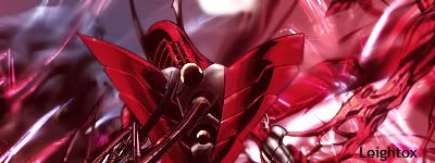
yes well here i am (again ) with another sig to show you all but this time i think it may be a good one. it is a bit messy but i love it ^^ well here it is
oh and i messed it up by adding a red gradiant map xD but its still good

![[show] WARNING EPIC SIG!](https://www.ownedcore.com/forums/./ocpbanners/1/2/9/8/0/2/2/01d9781faec8bfe3abf9095ac9e57d1e.jpg)
![[show] WARNING EPIC SIG!](https://www.ownedcore.com/assets/mm/images/wits.png "TradeSafe Middleman")
![[show] WARNING EPIC SIG!](https://www.ownedcore.com/forums/images/styles/OwnedCoreFX/addimg/wicc.png "CoreCoins")

User Tag List
Thread: [show] WARNING EPIC SIG!
Results 1 to 5 of 5
-
08-15-2008 #1
 Member
- Reputation
- 13
- Join Date
- Jun 2008
- Posts
- 220
- Thanks G/R
- 0/0
- Trade Feedback
- 0 (0%)
- Mentioned
- 0 Post(s)
- Tagged
- 0 Thread(s)
[show] WARNING EPIC SIG!
[L]eighto[X]
![[show] WARNING EPIC SIG!](https://www.ownedcore.com/images/ba/g/b2.gif)
-
08-15-2008 #2
Contributor

- Reputation
- 96
- Join Date
- Mar 2008
- Posts
- 667
- Thanks G/R
- 0/0
- Trade Feedback
- 0 (0%)
- Mentioned
- 0 Post(s)
- Tagged
- 0 Thread(s)

That looks really nice imo, looks bit weird when half of the sig is another color (or almost), and the text is a bit unclear and stuff but overall I really like it
 8/10
8/10

-
08-15-2008 #3
Member
- Reputation
- 13
- Join Date
- Jun 2008
- Posts
- 220
- Thanks G/R
- 0/0
- Trade Feedback
- 0 (0%)
- Mentioned
- 0 Post(s)
- Tagged
- 0 Thread(s)
yes lyk i said i messed it up with a red gradiant map but other than that i think its ok
[L]eighto[X]
-
08-15-2008 #4
Banned
- Reputation
- 365
- Join Date
- Aug 2007
- Posts
- 1,725
- Thanks G/R
- 0/0
- Trade Feedback
- 0 (0%)
- Mentioned
- 0 Post(s)
- Tagged
- 0 Thread(s)
If you could edit Chickensoups sig(made by Piersd) to make it look like yours you'd be a real pro ^_°Originally Posted by Leightox
I think what you should do is, don't focus on the background, focus on the render and try to blend it with the background, make the background fit the render, not otherwise, too much color for my taste in your sig, but compared to the others well done
-
08-15-2008 #5
Member
- Reputation
- 24
- Join Date
- Dec 2007
- Posts
- 524
- Thanks G/R
- 0/0
- Trade Feedback
- 0 (0%)
- Mentioned
- 0 Post(s)
- Tagged
- 0 Thread(s)

There pretty good just 1 thing.... text! you really have to work on that let it be ur #1 priority. And dont spend just like 10 seconds typing and chosing a font then putting it in a corner. try out different things with the text. Make it flow with your signature


 Reply With Quote
Similar Threads
-
[Show-off] New sig, av and random wallpaper
By Piersd in forum Art & Graphic DesignReplies: 1Last Post: 02-26-2008, 07:13 PM -
[Show Off] First Sig
By Elitefrost in forum Art & Graphic DesignReplies: 4Last Post: 01-23-2008, 03:41 PM -
[Show-off] My sigs, pls give feedback ;)
By mchugh in forum Art & Graphic DesignReplies: 13Last Post: 12-24-2007, 05:49 AM -
[Show-Off]Link Sig
By Strife117 in forum Art & Graphic DesignReplies: 0Last Post: 12-13-2007, 09:04 PM -
Show Off Ur Sig Skills
By fasck in forum Community ChatReplies: 9Last Post: 08-09-2006, 04:23 PM
-
OwnedCore Forums
casino news World of Warcraft Pokemon GO MMO Overwatch RTS Casino reviews www.planet-casino.com lucky 8 lucky8 no deposit codes bc game bc game lucky8 -
casino
Casino Gambling Online casinos Casino en ligne bc game bc game bc game no deposit bonus codes roobet Top 10 Casinos Casino reviews Bitcoin casino Paypal Casino Lucky8 1xbit heycasino US Gamecard.... Giveaway | 2 full info Bmewhy's l337 Scammin Uber Account US Gamecard need fake notary/ID to Need Help with Phisher Question on Battle.net [Help][PayPal] Scamming -
CoreCoins
CoreCoins CoreCoins FAQ Shout-Out Banner Ads -
My OwnedCore
My Profile Notifications Settings Buy CoreCoins About Us


Privacy Policy | Cookie Policy | Terms | Contact Us
Available Payment Methods:-
![[show] WARNING EPIC SIG!](https://www.ownedcore.com/images/paybutton/paypal.png)
![[show] WARNING EPIC SIG!](https://www.ownedcore.com/images/paybutton/skrill.png)
![[show] WARNING EPIC SIG!](https://www.ownedcore.com/images/paybutton/payop.png)
-
Casino
amazon | amazon | amazon | amazon | amazon | amazon | amazon | amazon | amazon | amazon | amazon | amazon | amazon | amazon | amazon | amazon | amazon | amazon | amazon | amazon | amazon | amazon | amazon | amazon | amazon | amazon | amazon | amazon | amazon | amazon | amazon | amazon | amazon | amazon | amazon | amazon | amazon | amazon | amazon | amazon | amazon | amazon | amazon | amazon | amazon | amazon | amazon | amazon | amazon | amazon | amazon | amazon | amazon | amazon | amazon | amazon | amazon | amazon | amazon | amazon