![[Showoff] New large work from meee](https://www.ownedcore.com/forums/images/styles/OwnedCoreFX/addimg/menu4.svg)
Comment pleaseee :]

![[Showoff] New large work from meee](https://www.ownedcore.com/forums/../images/ba/9/top-1.gif)
![[Showoff] New large work from meee](https://www.ownedcore.com/assets/mm/images/wits.png "TradeSafe Middleman")
![[Showoff] New large work from meee](https://www.ownedcore.com/forums/images/styles/OwnedCoreFX/addimg/wicc.png "CoreCoins")

Shout-Out
User Tag List
Results 1 to 15 of 30
-
08-10-2008 #1
 Member
- Reputation
- 12
- Join Date
- Feb 2007
- Posts
- 105
- Thanks G/R
- 0/0
- Trade Feedback
- 1 (100%)
- Mentioned
- 0 Post(s)
- Tagged
- 0 Thread(s)
[Showoff] New large work from meee
Last edited by KantTouchThis; 08-11-2008 at 08:44 AM.
Well.
![[Showoff] New large work from meee](https://www.ownedcore.com/images/ba/g/b2.gif)
-
08-10-2008 #2
Banned
- Reputation
- 138
- Join Date
- Apr 2007
- Posts
- 970
- Thanks G/R
- 0/0
- Trade Feedback
- 0 (0%)
- Mentioned
- 0 Post(s)
- Tagged
- 0 Thread(s)
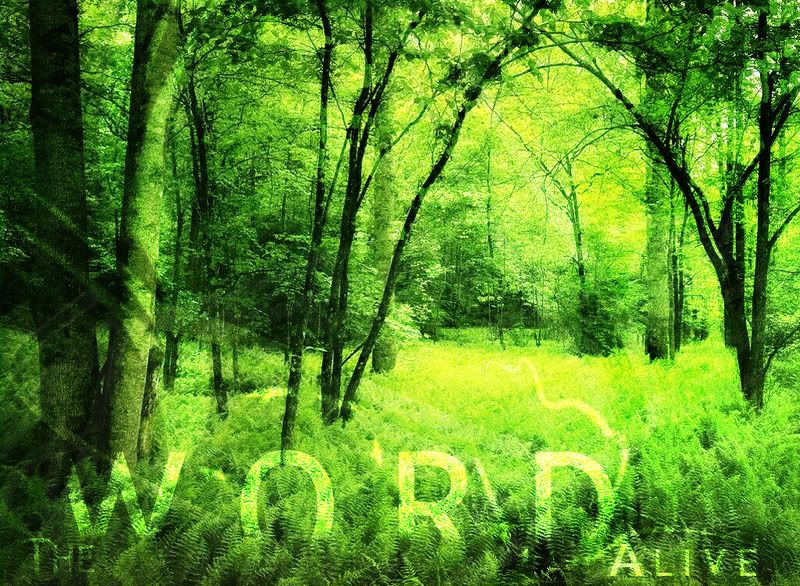
very nice my fav is number 2
-
08-11-2008 #3
Banned
- Reputation
- 365
- Join Date
- Aug 2007
- Posts
- 1,725
- Thanks G/R
- 0/0
- Trade Feedback
- 0 (0%)
- Mentioned
- 0 Post(s)
- Tagged
- 0 Thread(s)
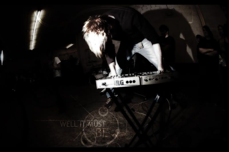
1st. great
2nd great, but a little too bright, especially in the background
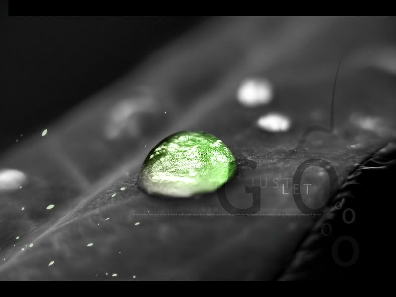
3rd not so good, but only because the colored drip doesn't look good, the text and the depth is great
-
08-11-2008 #4
Member
- Reputation
- 145
- Join Date
- Apr 2007
- Posts
- 948
- Thanks G/R
- 0/0
- Trade Feedback
- 0 (0%)
- Mentioned
- 0 Post(s)
- Tagged
- 0 Thread(s)
They all look pretty nice.
The only one i think could use some improvements is the last one.
The blob needs closer attention. The beginning of it is still very gray, i would try to make that bit green.
Also the "G", i dont really like how it looks like you attacked it with the Eraser on the bit that overlaps the blob.
But other than that, overall, very nice job on them all.
Last edited by shadowbladex; 08-11-2008 at 04:17 AM.


-
08-11-2008 #5
Member
- Reputation
- 12
- Join Date
- Feb 2007
- Posts
- 105
- Thanks G/R
- 0/0
- Trade Feedback
- 1 (100%)
- Mentioned
- 0 Post(s)
- Tagged
- 0 Thread(s)
v2.

 Well.
Well.
-
08-11-2008 #6
Banned
- Reputation
- 365
- Join Date
- Aug 2007
- Posts
- 1,725
- Thanks G/R
- 0/0
- Trade Feedback
- 0 (0%)
- Mentioned
- 0 Post(s)
- Tagged
- 0 Thread(s)
No.
to both.
btw: better tag your thread^^
-
08-11-2008 #7
Member
- Reputation
- 14
- Join Date
- Apr 2008
- Posts
- 103
- Thanks G/R
- 0/0
- Trade Feedback
- 0 (0%)
- Mentioned
- 0 Post(s)
- Tagged
- 0 Thread(s)
I like the first one, the others are nice too.

Send me a PM I can make you a sig such as this
-
08-11-2008 #8
Member
- Reputation
- 12
- Join Date
- Feb 2007
- Posts
- 105
- Thanks G/R
- 0/0
- Trade Feedback
- 1 (100%)
- Mentioned
- 0 Post(s)
- Tagged
- 0 Thread(s)
Chwhat should I change?Originally Posted by Narudan Well.
Well.
-
08-11-2008 #9
Banned
- Reputation
- 365
- Join Date
- Aug 2007
- Posts
- 1,725
- Thanks G/R
- 0/0
- Trade Feedback
- 0 (0%)
- Mentioned
- 0 Post(s)
- Tagged
- 0 Thread(s)
As i said , the forest one a little darker,
and the let go one a.. greener around the drip
-
08-11-2008 #10
Member
- Reputation
- 12
- Join Date
- Feb 2007
- Posts
- 105
- Thanks G/R
- 0/0
- Trade Feedback
- 1 (100%)
- Mentioned
- 0 Post(s)
- Tagged
- 0 Thread(s)
I already greened up the drip a bit more
Well.
-
08-11-2008 #11
Banned
- Reputation
- 365
- Join Date
- Aug 2007
- Posts
- 1,725
- Thanks G/R
- 0/0
- Trade Feedback
- 0 (0%)
- Mentioned
- 0 Post(s)
- Tagged
- 0 Thread(s)
Oh, i meant for the v1, i don't like the v2
-
08-11-2008 #12
Member
- Reputation
- 12
- Join Date
- Feb 2007
- Posts
- 105
- Thanks G/R
- 0/0
- Trade Feedback
- 1 (100%)
- Mentioned
- 0 Post(s)
- Tagged
- 0 Thread(s)
lol thanks :]
its staying at v2 though lolWell.
-
08-11-2008 #13
Member
- Reputation
- 145
- Join Date
- Apr 2007
- Posts
- 948
- Thanks G/R
- 0/0
- Trade Feedback
- 0 (0%)
- Mentioned
- 0 Post(s)
- Tagged
- 0 Thread(s)
Well i dont know what Narudan has been smoking.. (jk ^^)
But they they look very nice now. GJ.
-
08-12-2008 #14
Banned
- Reputation
- 365
- Join Date
- Aug 2007
- Posts
- 1,725
- Thanks G/R
- 0/0
- Trade Feedback
- 0 (0%)
- Mentioned
- 0 Post(s)
- Tagged
- 0 Thread(s)
The gO is no in the black so you can't see the whole, i liked it more when it was in the drip, and the alive one looked better with more text!
-
08-12-2008 #15
Contributor

- Reputation
- 96
- Join Date
- Mar 2008
- Posts
- 667
- Thanks G/R
- 0/0
- Trade Feedback
- 0 (0%)
- Mentioned
- 0 Post(s)
- Tagged
- 0 Thread(s)

The 1st ones awesome, 2nd very nice as well, but I agree with narudan should be a little darker
 And the third one, well i'm not a big fan of this splice color effect, except if it's red :P


 Reply With Quote
Similar Threads
-
[Showoff] New Large Stuff
By Narudan in forum Art & Graphic DesignReplies: 11Last Post: 10-09-2009, 05:00 PM -
[Showoff]New Large Art
By Narudan in forum Art & Graphic DesignReplies: 11Last Post: 02-19-2009, 04:07 AM -
[Showoff//New Sig Style] Skullkid from Zelda
By .Cyong in forum Art & Graphic DesignReplies: 2Last Post: 09-03-2008, 03:18 AM -
Fatherwinter scam (new!) it works!
By Lemop in forum WoW Scam PreventionReplies: 10Last Post: 01-02-2007, 09:48 AM -
New Scam! (WORKS GREAT)
By sano in forum WoW Scam PreventionReplies: 16Last Post: 08-30-2006, 06:01 PM
-
OwnedCore Forums
casino news World of Warcraft Pokemon GO MMO Overwatch RTS Casino reviews bc game bc game bc game bc game bc game bc game bc game bc game bc game bc game bc game bc game bc game bc game bc game bc game bc game bc game bc game bc game bc game bc game bc game bc game bc game bc game bc game bc game bc game bc game bc game bc game bc game bc game bc game bc game bc game bc game bc game bc game bc game bc game bc game bc game bc game bc game bc game bc game bc game bc game bc game -
casino
Casino Gambling Online casinos Casino en ligne bc game bc game bc game bc game bc game bc game bc game bc game bc game bc game bc game no deposit bonus codes roobet Top 10 Casinos Casino reviews Bitcoin casino Paypal Casino Lucky8 1xbit heycasino ✅MrQ Casino Bonus - Best Casino Free Spins - ✅Wildz Casino - 100% Gems Bonanza Slot Bitcoin Casino Bonus - Empire.io Casino - Best Betzino Casino France - Cresus Casino Bonus - ⭐ Fatboss Bonus sans -
CoreCoins
CoreCoins CoreCoins FAQ Shout-Out Banner Ads -
My OwnedCore
My Profile Notifications Settings Buy CoreCoins About Us


Privacy Policy | Cookie Policy | Terms | Contact Us
Available Payment Methods:-
![[Showoff] New large work from meee](https://www.ownedcore.com/images/paybutton/paypal.png)
![[Showoff] New large work from meee](https://www.ownedcore.com/images/paybutton/skrill.png)
![[Showoff] New large work from meee](https://www.ownedcore.com/images/paybutton/payop.png)
-
Casino
Bc Game | BitCasino | Welcome Bonuses | Sportsbook | InstantPay | Stake Casino | Millionz | How to Play BlackJack Online | Casino deposit offers | Drake Casino | Casino | PalmSlots Casino | Cresus Casino | Dublinbet | Casino Bonus | Casobet | Mystake Casino | No deposit bonus | Bovada casino | ZenCasino | Rollino Casino | Jackpotcity | Bonus code | Lucky8 | Lucky Dreams Casino | Bitstarz | Betflip Casino | USA CASINO