![[Rate]New sigy (best)](https://www.ownedcore.com/forums/images/styles/OwnedCoreFX/addimg/menu4.svg)
well every1 i tohught i would show u my new sig and avatar i think it looks cool but it up to you rate comment and tell em whats right and wrong (i no the text font sux)
and if u want a sig(or avatar)like mine vist my sig shop :P
here it is


![[Rate]New sigy (best)](https://www.ownedcore.com/forums/./ocpbanners/1/2/9/8/0/2/2/01d9781faec8bfe3abf9095ac9e57d1e.jpg)
![[Rate]New sigy (best)](https://www.ownedcore.com/assets/mm/images/wits.png "TradeSafe Middleman")
![[Rate]New sigy (best)](https://www.ownedcore.com/forums/images/styles/OwnedCoreFX/addimg/wicc.png "CoreCoins")

User Tag List
Thread: [Rate]New sigy (best)
Results 1 to 7 of 7
-
07-05-2008 #1
 Member
- Reputation
- 13
- Join Date
- Jun 2008
- Posts
- 220
- Thanks G/R
- 0/0
- Trade Feedback
- 0 (0%)
- Mentioned
- 0 Post(s)
- Tagged
- 0 Thread(s)
[Rate]New sigy (best)
[L]eighto[X]
![[Rate]New sigy (best)](https://www.ownedcore.com/images/ba/g/b2.gif)
-
07-05-2008 #2
Banned
- Reputation
- 365
- Join Date
- Aug 2007
- Posts
- 1,725
- Thanks G/R
- 0/0
- Trade Feedback
- 0 (0%)
- Mentioned
- 0 Post(s)
- Tagged
- 0 Thread(s)
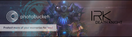
The font is awesome.
-
07-05-2008 #3
Member
- Reputation
- 13
- Join Date
- Jun 2008
- Posts
- 220
- Thanks G/R
- 0/0
- Trade Feedback
- 0 (0%)
- Mentioned
- 0 Post(s)
- Tagged
- 0 Thread(s)
oh k
 lol thnx hehe
[L]eighto[X]
-
07-05-2008 #4
Member
- Reputation
- 52
- Join Date
- Feb 2008
- Posts
- 569
- Thanks G/R
- 0/0
- Trade Feedback
- 0 (0%)
- Mentioned
- 0 Post(s)
- Tagged
- 0 Thread(s)

Looks okay, Text doesnt go too good, and the effect you have on it doesnt look nice imo.
-
07-05-2008 #5
Banned
- Reputation
- 365
- Join Date
- Aug 2007
- Posts
- 1,725
- Thanks G/R
- 0/0
- Trade Feedback
- 0 (0%)
- Mentioned
- 0 Post(s)
- Tagged
- 0 Thread(s)
I meant the font, not the text, and @ ease, i think the effects on this sig are great if you compare them to his other sigs, but the duplicated splatter brush on the left doesn't look good
-
07-05-2008 #6
Member
- Reputation
- 52
- Join Date
- Feb 2008
- Posts
- 569
- Thanks G/R
- 0/0
- Trade Feedback
- 0 (0%)
- Mentioned
- 0 Post(s)
- Tagged
- 0 Thread(s)
Yeah, I forgot to compare to his other.
This is far the best.
The font is plain wich is allways epic and allways works! Good choice, I h8 seeing people with crappy fonts.
Splatter brush would've been okay if you only did it once.
Good positioning on the Lens Flare as i've seen you before not position it well at all.
Overall 7/10
Keep up the work.
-
07-05-2008 #7
Contributor

- Reputation
- 196
- Join Date
- Mar 2007
- Posts
- 960
- Thanks G/R
- 0/0
- Trade Feedback
- 0 (0%)
- Mentioned
- 0 Post(s)
- Tagged
- 0 Thread(s)
imo your best
but i disagree with the others about the font. it is too big and its beveled. please don't bevel the text, so many people bevel it because it makes it look cool or something... it doesn't go so well. make the text smaller and move it somewhere closer to the render. you should try smudging or brushing over the render to blend it in some more.
hopefully that helps somehow.


 Reply With Quote
Similar Threads
-
[rate] new sigs
By Anarchy [RD] in forum Art & Graphic DesignReplies: 1Last Post: 03-29-2008, 12:25 PM -
[Rate] New Signature
By EliteZodiaC in forum Art & Graphic DesignReplies: 5Last Post: 01-21-2008, 04:17 PM -
[Rate] New Sig
By Cheesy in forum Art & Graphic DesignReplies: 7Last Post: 01-21-2008, 10:20 AM -
Rate new sig
By EliMob441 in forum Art & Graphic DesignReplies: 5Last Post: 10-04-2007, 12:26 AM -
Rate New Sigs
By GoombaMan in forum Art & Graphic DesignReplies: 1Last Post: 09-19-2007, 05:14 PM
-
OwnedCore Forums
casino news World of Warcraft Pokemon GO MMO Overwatch RTS Casino reviews www.planet-casino.com lucky 8 lucky8 no deposit codes bc game bc game lucky8 -
casino
Casino Gambling Online casinos Casino en ligne bc game bc game bc game no deposit bonus codes roobet Top 10 Casinos Casino reviews Bitcoin casino Paypal Casino Lucky8 1xbit heycasino EU TBC account Help me selling accounts Little bit of help here, [Request/Help] Alliance Gold Delivery... Search Wotlk CD Key About phone call on gold [Anti-Scam] Program Free full info accs! -
CoreCoins
CoreCoins CoreCoins FAQ Shout-Out Banner Ads -
My OwnedCore
My Profile Notifications Settings Buy CoreCoins About Us


Privacy Policy | Cookie Policy | Terms | Contact Us
Available Payment Methods:-
![[Rate]New sigy (best)](https://www.ownedcore.com/images/paybutton/paypal.png)
![[Rate]New sigy (best)](https://www.ownedcore.com/images/paybutton/skrill.png)
![[Rate]New sigy (best)](https://www.ownedcore.com/images/paybutton/payop.png)