![[Showoff]Took a Break, Now I am Back](https://www.ownedcore.com/forums/images/styles/OwnedCoreFX/addimg/menu4.svg)
Here are some Sig's I just made:
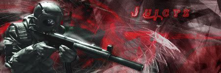
Some CoD4 Stuff I Made.., I know I need a Border
Just Made For Fun..
Rate Plz 1/10
Advise Welcomed
Just Post Some Thing, I like Posts

![[Showoff]Took a Break, Now I am Back](https://www.ownedcore.com/forums/./ocpbanners/1/2/9/8/0/2/2/01d9781faec8bfe3abf9095ac9e57d1e.jpg)
![[Showoff]Took a Break, Now I am Back](https://www.ownedcore.com/assets/mm/images/wits.png "TradeSafe Middleman")
![[Showoff]Took a Break, Now I am Back](https://www.ownedcore.com/forums/images/styles/OwnedCoreFX/addimg/wicc.png "CoreCoins")

Shout-Out
User Tag List
Results 1 to 7 of 7
-
05-13-2008 #1
 Active Member

- Reputation
- 34
- Join Date
- Dec 2006
- Posts
- 298
- Thanks G/R
- 0/0
- Trade Feedback
- 0 (0%)
- Mentioned
- 0 Post(s)
- Tagged
- 0 Thread(s)

[Showoff]Took a Break, Now I am Back

DA Gift From Mr. Blain
![[Showoff]Took a Break, Now I am Back](https://www.ownedcore.com/images/ba/g/b2.gif)
-
05-13-2008 #2
 Contributor


- Reputation
- 174
- Join Date
- Sep 2006
- Posts
- 930
- Thanks G/R
- 0/1
- Trade Feedback
- 0 (0%)
- Mentioned
- 0 Post(s)
- Tagged
- 0 Thread(s)

5/10 for hte first (render doesnt fit)
10/10 for the 2nd very good
-
05-13-2008 #3
Active Member
- Reputation
- 34
- Join Date
- Dec 2006
- Posts
- 298
- Thanks G/R
- 0/0
- Trade Feedback
- 0 (0%)
- Mentioned
- 0 Post(s)
- Tagged
- 0 Thread(s)
WOOT Gratz First Post!!! Thank You.. I know the First one is bad
DA Gift From Mr. Blain
-
05-14-2008 #4
Knight-Lieutenant
- Reputation
- 20
- Join Date
- Feb 2008
- Posts
- 282
- Thanks G/R
- 0/0
- Trade Feedback
- 0 (0%)
- Mentioned
- 0 Post(s)
- Tagged
- 0 Thread(s)
Hello! Welcome back
 ok so on topic:
first one:
Colours dosnt match and the text dosnt fit. and the my eyes draws to the white c4d in the middle, not the render. But thats just the bad stuff. Other then that it's great ^^ 6/10
Second one:
Theme is good, text is good, backround is good. But! the render has a white area around it. mostly on the left part. 8/10.
And once again, good to have you back. C ya!
-
05-14-2008 #5
Member
- Reputation
- 143
- Join Date
- Sep 2007
- Posts
- 656
- Thanks G/R
- 0/0
- Trade Feedback
- 0 (0%)
- Mentioned
- 0 Post(s)
- Tagged
- 0 Thread(s)
i like the concept behind the first one, but personally i dont think the render does you any favours, because its so dark it limits the blending possibilities without tottaly hiding it. i think you should consider adding a distinctive light source to match with the lighting on the render, and then continue this into the background a bit. i like how the right of the render blends with the background but t6he edges of the render are a bit jagged and need some smoothing work. as the light is coming from the middle left of the sig (over the renders shoulder) you should consider lightenning the left of the sig and darkening the right a bit more. also consider putting some of the c4ds in the background on different layer properties so that they have different colour levels and provide different light/dark depth levels
i really like the brush work in the background of this, to help improve the brush work i think around the render (so all behind it) you should brush light that dispers out through the sig.
regarding the render you need to add a gradient map or alter the colour balance of it as currently the hue/saturation levels are extreemley bright compared to the rest of the sig making it stand out alot ruining the depth. try brush from the edges of the render (more so on the side where the shadows will be) so that it blends with the background and doesnt show where the render edges start as much.
i like your text placement it fits quite well, consider making a full fill text some other time and use multiple layers with different textures and colours all on overlay so they blend with the rest of the background.

Love isn't an emotion or an instinct - it is an Art
-
05-14-2008 #6
Active Member
- Reputation
- 34
- Join Date
- Dec 2006
- Posts
- 298
- Thanks G/R
- 0/0
- Trade Feedback
- 0 (0%)
- Mentioned
- 0 Post(s)
- Tagged
- 0 Thread(s)
Okay Thank You
, im trying to make the renders blend in a lot better, but its not working lolz.... My Renders stand out too much, I try using the OP but they um.... Look like they are overlapped or some thing..
DA Gift From Mr. Blain
-
05-17-2008 #7
Member
- Reputation
- 1
- Join Date
- Nov 2007
- Posts
- 27
- Thanks G/R
- 0/0
- Trade Feedback
- 0 (0%)
- Mentioned
- 0 Post(s)
- Tagged
- 0 Thread(s)
I'm gonna say 4/10 for the first and 4/10 for the second also
You have a good concept, but virtually no colors. The text is meh
I also like how you have flow going. You look like your getting the hang of the "style" of your sigs, but now you need to learn: Lighting, blending, colors, text, etc. You will make good sigs one day
Best of luck mate


 Reply With Quote
Similar Threads
-
[Showoff]Maya Weapon - YAY I AM BACK
By fasck in forum World of Warcraft Model EditingReplies: 23Last Post: 08-03-2008, 06:25 PM -
Leveling services now back up!(omgcool7)
By omgcool7 in forum Members Only Gold And Powerleveling Buy SellReplies: 13Last Post: 07-06-2008, 03:38 AM -
[Showoff] Old Sigs I made A Bit Back
By Cigma in forum Art & Graphic DesignReplies: 5Last Post: 02-19-2008, 11:02 AM
-
OwnedCore Forums
casino news World of Warcraft Pokemon GO MMO Overwatch RTS Casino reviews www.planet-casino.com lucky 8 lucky8 no deposit codes bc game bc game lucky8 -
casino
Casino Gambling Online casinos Casino en ligne bc game bc game bc game no deposit bonus codes roobet Top 10 Casinos Casino reviews Bitcoin casino Paypal Casino Lucky8 1xbit heycasino [Help] Will Walk you through a Help! Scammed Account Paypal problems.. help So I uninstalled WoW... Having some Problems Demonoid invites! Max bulk mailer, how do [request] Tube Increaser -
CoreCoins
CoreCoins CoreCoins FAQ Shout-Out Banner Ads -
My OwnedCore
My Profile Notifications Settings Buy CoreCoins About Us


Privacy Policy | Cookie Policy | Terms | Contact Us
Available Payment Methods:-
![[Showoff]Took a Break, Now I am Back](https://www.ownedcore.com/images/paybutton/paypal.png)
![[Showoff]Took a Break, Now I am Back](https://www.ownedcore.com/images/paybutton/skrill.png)
![[Showoff]Took a Break, Now I am Back](https://www.ownedcore.com/images/paybutton/payop.png)
-
Casino
stake | stake | shuffle | stake | this url | shuffle | shuffle | shuffle | shuffle | shuffle | HashLucky Casino | shuffle | casino | shuffle | shuffle | shuffle | casino | shuffle | shuffle | shuffle | Top 5 canadian online casinos 2025 | shuffle | here | Shuffle Casino | shuffle | shuffle | this | this url | shuffle | shuffle | shuffle | shuffle | Blockchain gambling | casino | stake | shuffle | shuffle | stake | shuffle | shuffle | shuffle | shuffle | this | shuffle | stake | stake | shuffle | stake | Instant Payout Methods | shuffle | this | shuffle | Aviator game casino | shuffle | this url | shuffle | stake | shuffle | shuffle | Bitstarz Tournament