![[Showoff/Rate/Suggestions]](https://www.ownedcore.com/forums/images/styles/OwnedCoreFX/addimg/menu4.svg)
Here is my first attempt at sigs in awhile.
Please rate these 0-10 Thanks
Give me suggestions on what i should change in my work
I realize this one is awful because of where i messed up (don't criticize on that please) thanks


![[Showoff/Rate/Suggestions]](https://www.ownedcore.com/forums/./ocpbanners/1/2/9/8/0/2/2/01d9781faec8bfe3abf9095ac9e57d1e.jpg)
![[Showoff/Rate/Suggestions]](https://www.ownedcore.com/assets/mm/images/wits.png "TradeSafe Middleman")
![[Showoff/Rate/Suggestions]](https://www.ownedcore.com/forums/images/styles/OwnedCoreFX/addimg/wicc.png "CoreCoins")

User Tag List
Thread: [Showoff/Rate/Suggestions]
Results 1 to 9 of 9
-
04-19-2008 #1
 Member
- Reputation
- 11
- Join Date
- Jul 2007
- Posts
- 85
- Thanks G/R
- 0/0
- Trade Feedback
- 0 (0%)
- Mentioned
- 0 Post(s)
- Tagged
- 0 Thread(s)
[Showoff/Rate/Suggestions]
![[Showoff/Rate/Suggestions]](https://www.ownedcore.com/images/ba/g/b2.gif)
-
04-19-2008 #2
Banned
- Reputation
- 179
- Join Date
- Jan 2008
- Posts
- 1,396
- Thanks G/R
- 0/0
- Trade Feedback
- 0 (0%)
- Mentioned
- 0 Post(s)
- Tagged
- 0 Thread(s)
heres some CC.
1. Don't use the same font everytime (In some sigs try making it small)
2. It needs some more effects. I.e those are just smudges with a render places on outter glow.
3. Don't use bevel and things that makes the render "Pop" out.
-
04-19-2008 #3
Member
- Reputation
- 11
- Join Date
- Jul 2007
- Posts
- 85
- Thanks G/R
- 0/0
- Trade Feedback
- 0 (0%)
- Mentioned
- 0 Post(s)
- Tagged
- 0 Thread(s)
Thanks for feedback... but did you ever think mabye i made some of them pop out? (ex.) the dragon... (on purpose)
~Thanks Cgrock~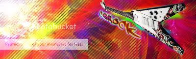
-
04-19-2008 #4
Banned
- Reputation
- 179
- Join Date
- Jan 2008
- Posts
- 1,396
- Thanks G/R
- 0/0
- Trade Feedback
- 0 (0%)
- Mentioned
- 0 Post(s)
- Tagged
- 0 Thread(s)
What i meant by that was....like sometimes you don't need to/it ruins your sig when you try to make it pop out by setting it on bevel and emboss
-
04-19-2008 #5
Active Member

- Reputation
- 30
- Join Date
- Nov 2006
- Posts
- 192
- Thanks G/R
- 0/0
- Trade Feedback
- 0 (0%)
- Mentioned
- 0 Post(s)
- Tagged
- 0 Thread(s)
I think that the last sig looks totally awesome! 12/10 for that one. The other two I'm not as keen on.
on the top two the background and text dont really match IMO. 6/10
But hey, that's just my oppinion.
-
04-19-2008 #6
Active Member
- Reputation
- 34
- Join Date
- Dec 2006
- Posts
- 298
- Thanks G/R
- 0/0
- Trade Feedback
- 0 (0%)
- Mentioned
- 0 Post(s)
- Tagged
- 0 Thread(s)

I know you said dont critize on the second one, but it would look better if u darkened the fourhead...... It stands out.

DA Gift From Mr. Blain
-
04-19-2008 #7
Contributor

- Reputation
- 196
- Join Date
- Mar 2007
- Posts
- 960
- Thanks G/R
- 0/0
- Trade Feedback
- 0 (0%)
- Mentioned
- 0 Post(s)
- Tagged
- 0 Thread(s)
i really like the third one, but the big ugly text and the beveled border ruins it for me. try to stay away from bevel, it usually looks cool when you first start, but then you realise it looks pretty bad after all this time

Over all i think you should add some different effects instead of a duplicate render and then smudging it or liquifying it. Get some brushes, follow tutorials and try different things. And most of all, stay away from bevel lol

-
04-19-2008 #8
Member
- Reputation
- 97
- Join Date
- Aug 2007
- Posts
- 636
- Thanks G/R
- 0/0
- Trade Feedback
- 0 (0%)
- Mentioned
- 0 Post(s)
- Tagged
- 0 Thread(s)
Sigh..I'm not even going to CC, I'm sorry. All I want to say is that people need to take a look at some tutorials. These just look cheesy man, you have some great ideas you just need more of a guideline to follow, then you will improve. If you need links to improve just pm me.

Visit my Sig/Av Shop! (Shinyshoes=Male)
-
04-19-2008 #9
Member
- Reputation
- 93
- Join Date
- Apr 2007
- Posts
- 447
- Thanks G/R
- 0/0
- Trade Feedback
- 0 (0%)
- Mentioned
- 0 Post(s)
- Tagged
- 0 Thread(s)
This just looks like you got a picture, smudged it, beveled it, put an outer glow and stuck your name on it. I don't like all three to be frank. the way you build a sig is to have depth and flow... I cannot find that anywhere in these three. Remember to always use colours that will compliment the render.
-Bob


 Reply With Quote
Similar Threads
-
[showoff/rate] kingdom hearts 2 {sora} sig
By Anarchy [RD] in forum Art & Graphic DesignReplies: 11Last Post: 03-27-2008, 12:59 AM -
[Showoff/Rate/CC] My newest sig
By Reflection in forum Art & Graphic DesignReplies: 13Last Post: 03-24-2008, 04:09 AM -
[Showoff/Rate] My newest sig
By Anarchy [RD] in forum Art & Graphic DesignReplies: 4Last Post: 03-22-2008, 04:01 PM -
[Showoff] Rate my first ever sig!
By pyrojunkie in forum Art & Graphic DesignReplies: 3Last Post: 12-12-2007, 02:03 AM
-
OwnedCore Forums
casino news World of Warcraft Pokemon GO MMO Overwatch RTS Casino reviews www.planet-casino.com lucky 8 lucky8 no deposit codes bc game bc game lucky8 -
casino
Casino Gambling Online casinos Casino en ligne bc game bc game bc game no deposit bonus codes roobet Top 10 Casinos Casino reviews Bitcoin casino Paypal Casino Lucky8 1xbit heycasino just got a account with Suggestions ELITE glider giveaway (1 VB random number How do I avoid being Some free EU accounts What to do...? Free US ACCOUNT 6 70'S Account has about 4 or 5 -
CoreCoins
CoreCoins CoreCoins FAQ Shout-Out Banner Ads -
My OwnedCore
My Profile Notifications Settings Buy CoreCoins About Us


Privacy Policy | Cookie Policy | Terms | Contact Us
Available Payment Methods:-
![[Showoff/Rate/Suggestions]](https://www.ownedcore.com/images/paybutton/paypal.png)
![[Showoff/Rate/Suggestions]](https://www.ownedcore.com/images/paybutton/skrill.png)
![[Showoff/Rate/Suggestions]](https://www.ownedcore.com/images/paybutton/payop.png)