![[Show-Off/CC] Latest sigs i've made](https://www.ownedcore.com/forums/images/styles/OwnedCoreFX/addimg/menu4.svg)
well i haven't been on mmowned for some time and then i went on cadet camp (army shiz, not the real army just marching lol)
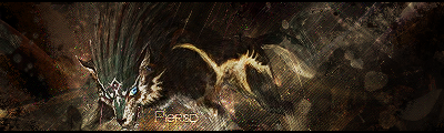
these are sorta different from most of my other sigs, i just wanted to try something new
i tried making a sig with a stock, its new to me ok lol. i followed a tutorial (which didn't really help at all >_>), but it came in some resource package so i can't get a link... i think i got the resources from one of phase's graphics post some time ago. please notice that this is a WIP (work in progress), i could probably add some more to it, but cbf lol.
i'm not that happy with the text on this one... i haven't got much to say bout it :S
that's almost finished, i still have to add text and some other shiz, but cbf lol :P. before shiny points it out, i wanted to get something like this without following the tut, just something that sort of looks like it.
EDIT:
andOriginally Posted by Piersd
Originally Posted by Piersd

![[Show-Off/CC] Latest sigs i've made](https://www.ownedcore.com/forums/./ocpbanners/1/2/9/8/0/2/2/01d9781faec8bfe3abf9095ac9e57d1e.jpg)
![[Show-Off/CC] Latest sigs i've made](https://www.ownedcore.com/assets/mm/images/wits.png "TradeSafe Middleman")
![[Show-Off/CC] Latest sigs i've made](https://www.ownedcore.com/forums/images/styles/OwnedCoreFX/addimg/wicc.png "CoreCoins")

Shout-Out
User Tag List
Results 1 to 15 of 31
-
04-14-2008 #1
 Contributor

- Reputation
- 196
- Join Date
- Mar 2007
- Posts
- 960
- Thanks G/R
- 0/0
- Trade Feedback
- 0 (0%)
- Mentioned
- 0 Post(s)
- Tagged
- 0 Thread(s)
[Show-Off/CC] Latest sigs i've made
Last edited by Piersd; 04-19-2008 at 09:08 PM.

![[Show-Off/CC] Latest sigs i've made](https://www.ownedcore.com/images/ba/g/b2.gif)
-
04-14-2008 #2
Contributor
- Reputation
- 132
- Join Date
- Jan 2008
- Posts
- 547
- Thanks G/R
- 0/2
- Trade Feedback
- 0 (0%)
- Mentioned
- 0 Post(s)
- Tagged
- 0 Thread(s)
![Send a message via ICQ to Anarchy [RD]](https://www.ownedcore.com/forums/images/styles/OwnedCoreFX/misc/im_icq.gif)
![Send a message via AIM to Anarchy [RD]](https://www.ownedcore.com/forums/images/styles/OwnedCoreFX/misc/im_aim.gif)
![Send a message via MSN to Anarchy [RD]](https://www.ownedcore.com/forums/images/styles/OwnedCoreFX/misc/im_msn.gif)
![Send a message via Yahoo to Anarchy [RD]](https://www.ownedcore.com/forums/images/styles/OwnedCoreFX/misc/im_yahoo.gif)
![Send a message via Skype™ to Anarchy [RD]](https://www.ownedcore.com/forums/images/styles/OwnedCoreFX/misc/im_skype.gif)
these are nice dude
 tell me what u think of my current sig just made it.
my fav is the one of Kakashi
il give em an overall rating of 26/30 (thats a combined rating) rofl
Edit:
with that sig u made with a stock, it was from the addictive arts pack
on this page right? > http://www.mmowned.com/forums/graphi...ics-stuff.htmlLast edited by Anarchy [RD]; 04-15-2008 at 01:12 AM.

-
04-14-2008 #3
Active Member

- Reputation
- 34
- Join Date
- Dec 2006
- Posts
- 298
- Thanks G/R
- 0/0
- Trade Feedback
- 0 (0%)
- Mentioned
- 0 Post(s)
- Tagged
- 0 Thread(s)
Nice Sigs, I Like the Last One the best with the light shinging on him (I forget his name) Methoid or some thing.. Anarchy I like your New Sig
lolz the green eyes

DA Gift From Mr. Blain
-
04-14-2008 #4
Member
- Reputation
- 97
- Join Date
- Aug 2007
- Posts
- 636
- Thanks G/R
- 0/0
- Trade Feedback
- 0 (0%)
- Mentioned
- 0 Post(s)
- Tagged
- 0 Thread(s)
I think it's really good that you are trying out new styles, I myself am trying the same thing ( a new style: Realistic/realpeople)
I really like most of them, they look a bit simple, but as you said they are works in progress. A little more detail here and there and you've got some pretty awesome sigs
-shiny

Visit my Sig/Av Shop! (Shinyshoes=Male)
-
04-14-2008 #5
Banned
- Reputation
- 179
- Join Date
- Jan 2008
- Posts
- 1,396
- Thanks G/R
- 0/0
- Trade Feedback
- 0 (0%)
- Mentioned
- 0 Post(s)
- Tagged
- 0 Thread(s)
The Kakashi one is a 10/10 from me

-
04-15-2008 #6
Member
- Reputation
- 93
- Join Date
- Apr 2007
- Posts
- 447
- Thanks G/R
- 0/0
- Trade Feedback
- 0 (0%)
- Mentioned
- 0 Post(s)
- Tagged
- 0 Thread(s)
Her name is Samus.Originally Posted by Warlockrules
Nice sigs as always piersd! I like the naruto one. 7/10,7.5/10,7/10
-
04-15-2008 #7
Member
- Reputation
- 143
- Join Date
- Sep 2007
- Posts
- 656
- Thanks G/R
- 0/0
- Trade Feedback
- 0 (0%)
- Mentioned
- 0 Post(s)
- Tagged
- 0 Thread(s)
once again i think they are very nice sigs, especially considering its an attempt at a new style. my favourite of the three is the last one, despite you claiming it to be unfinished i still feel it looks finished and has nice flow to it. comparing that to the tutorial you were trying to follow i personally think this one looks better than the tutorials outcome, it has more flow, depth, it feels as though there is movement in it which is helped with some precise lighting.
sig 1 for me isnt particularly in a style i prefer but i think the outcome works well. i can see the aim and style of the sig it just feels lacking around the edges of it, and the excessive amount of blood splatters (redness) i dont think help to provide a contrast in the sig. i like how you are drawn into the focal point which looks very detailed but when spreading the view out more i find it lacking in other detail
the naruto sig i think looks nicely finished and the render fits very well with the rest of the sig. i feel the colour choices in it are great, both to blend the render with the background and to add depth through the multiple gradients. i dont think the text is bad, i feel its in the correct style with the sig and is subtle so it fits well. my criticism would be witht he light source, it draws the eye in but looks a bit to heavy as it disperses out, around the neck/mouth area it doesnt follow the gradient of the face as it would (but thats just been picky)
overall really nice job, keep practising with a variety of work.
but for each of your unfinished work though i think you should consider adding text just to stop rippers as im sure there are people out there that will see this as a free opportunity to claim graphics as theres.
edit: just realised massive wall of text sorry about that

Love isn't an emotion or an instinct - it is an Art
-
04-15-2008 #8
Member
- Reputation
- 1
- Join Date
- Apr 2007
- Posts
- 10
- Thanks G/R
- 0/0
- Trade Feedback
- 0 (0%)
- Mentioned
- 0 Post(s)
- Tagged
- 0 Thread(s)
very nice iv always liked metroid +REP
-
04-15-2008 #9
Banned
- Reputation
- 31
- Join Date
- May 2007
- Posts
- 769
- Thanks G/R
- 0/0
- Trade Feedback
- 0 (0%)
- Mentioned
- 0 Post(s)
- Tagged
- 0 Thread(s)
Me <3 Kakashi Signature! :P
-
04-19-2008 #10
Contributor
- Reputation
- 196
- Join Date
- Mar 2007
- Posts
- 960
- Thanks G/R
- 0/0
- Trade Feedback
- 0 (0%)
- Mentioned
- 0 Post(s)
- Tagged
- 0 Thread(s)
thanks for all the feedback everyone, but carlosj and shiny mostly (coz they actually gave some cc)
i probably would finish these, but lately i've just been real lazy lol. though i never really thought anyone would want to rip these :/
someone suggested that i should open up a service... anyone else think i should?
-
04-19-2008 #11
Contributor
- Reputation
- 92
- Join Date
- Dec 2007
- Posts
- 649
- Thanks G/R
- 0/0
- Trade Feedback
- 0 (0%)
- Mentioned
- 0 Post(s)
- Tagged
- 0 Thread(s)
well big paragraphs as alwaysOriginally Posted by carlosj
 you should do some art at some time carlos with amount of stuff you know about graphics you could do awesome sigs, avatars and banners well thats only if you want to so yea even i learn from the wall of text (no offence) so thanks
you did.......but i dunno where it went but yes open a service also awesome kakashi sensei sig lol im sure 2-3 people on here know im a naruto fan but alot of people don't like the show but oh well i reckon its not too badOriginally Posted by Piersd

-
04-19-2008 #12
Contributor
- Reputation
- 196
- Join Date
- Mar 2007
- Posts
- 960
- Thanks G/R
- 0/0
- Trade Feedback
- 0 (0%)
- Mentioned
- 0 Post(s)
- Tagged
- 0 Thread(s)
yeah it uhh, kinda died
 . its over 2 weeks old so i don't think i should be bumping it...
-
04-19-2008 #13
Contributor
- Reputation
- 92
- Join Date
- Dec 2007
- Posts
- 649
- Thanks G/R
- 0/0
- Trade Feedback
- 0 (0%)
- Mentioned
- 0 Post(s)
- Tagged
- 0 Thread(s)
yea [necro posting = flaming = closed] so maybe start a new thread hehe then you can post your work and then requests will fly in lol
-
04-19-2008 #14
Member
- Reputation
- 143
- Join Date
- Sep 2007
- Posts
- 656
- Thanks G/R
- 0/0
- Trade Feedback
- 0 (0%)
- Mentioned
- 0 Post(s)
- Tagged
- 0 Thread(s)
hehe thanks alotOriginally Posted by Vemonous
i try to condense my paragraphs but sometimes i just cant delete it without posting something thats a) unhelpful B) doesnt fully explain what im trying to get across.
yeah i used to occasionally do some art when i first got into graphics, i pmd you all of my stuff a while back which as you can probably see is very limited.
i always promise myself to actually make work i just never find the time unless its a specific request i really want to do e.g. that dj one laura asked for.
guess it should as im probably starting to sound really hypocritical, telling others what to do yet not doing it all myself
and piersd definitely open a shop again i love your stuff, im still using the sig you made me cause i love it
strange cant pick colours from colour box....
Love isn't an emotion or an instinct - it is an Art
-
04-19-2008 #15
Contributor
- Reputation
- 196
- Join Date
- Mar 2007
- Posts
- 960
- Thanks G/R
- 0/0
- Trade Feedback
- 0 (0%)
- Mentioned
- 0 Post(s)
- Tagged
- 0 Thread(s)
if some more people want me to open up a service, i might. i saw carlosj with grey text :O.
i just made that, has text this time and its finished lol. i used some smudge and splatter brushes for this (and a few c4ds )


 Reply With Quote
Similar Threads
-
[Show off]my latest sig
By Syplex23 in forum Art & Graphic DesignReplies: 11Last Post: 04-09-2008, 06:17 AM -
[Show-Off][Rate] A new WP i made.
By Lord-kapser in forum Art & Graphic DesignReplies: 5Last Post: 02-22-2008, 08:19 AM -
[Rate/Show-Off] Some new sigs i made
By Piersd in forum Art & Graphic DesignReplies: 3Last Post: 02-10-2008, 04:25 AM -
[Show-Off] My new Sig. please comment.
By Cryt in forum Art & Graphic DesignReplies: 10Last Post: 01-07-2008, 04:30 AM -
[Show-Off]The first sig you ever made!
By Trucido in forum Art & Graphic DesignReplies: 21Last Post: 12-05-2007, 05:51 AM
-
OwnedCore Forums
casino news World of Warcraft Pokemon GO MMO Overwatch RTS Casino reviews bc game bc game bc game bc game bc game bc game bc game bc game bc game bc game bc game bc game bc game bc game bc game bc game bc game bc game bc game bc game bc game bc game bc game bc game bc game bc game bc game bc game bc game bc game bc game bc game bc game bc game bc game bc game bc game bc game bc game bc game bc game bc game bc game bc game bc game bc game bc game bc game bc game bc game bc game -
casino
Casino Gambling Online casinos Casino en ligne bc game bc game bc game bc game bc game bc game bc game bc game bc game bc game bc game no deposit bonus codes roobet Top 10 Casinos Casino reviews Bitcoin casino Paypal Casino Lucky8 1xbit heycasino Ruby vegas casino - No Bitstarz Casino - No ✅ThorCasino Casino - Stake No deposit Bonus Betsson Bookmaker - Top ✅Bitkingz Casino - BetKing Bookmaker - Best Honey Rush 100 Slot - ✅Leovegas Casino -
CoreCoins
CoreCoins CoreCoins FAQ Shout-Out Banner Ads -
My OwnedCore
My Profile Notifications Settings Buy CoreCoins About Us


Privacy Policy | Cookie Policy | Terms | Contact Us
Available Payment Methods:-
![[Show-Off/CC] Latest sigs i've made](https://www.ownedcore.com/images/paybutton/paypal.png)
![[Show-Off/CC] Latest sigs i've made](https://www.ownedcore.com/images/paybutton/skrill.png)
![[Show-Off/CC] Latest sigs i've made](https://www.ownedcore.com/images/paybutton/payop.png)
-
Casino
NeedForSpin | Stake Casino | Lucky31 | InstantPay | Dublinbet | BitCasino | MrGreen | Casino Bonus | ZenCasino | Casino | PalmSlots Casino | Drake Casino | Bonus code | How to Play BlackJack Online | Jackpotcity | Bc Game | Cresus Casino | Millionz | Betflip Casino | Casino deposit offers | Bovada casino | Crypto Casino | Casino Reviews | USA CASINO | Mystake Casino | BuzzLuck | No deposit bonus | Sportsbook | Oshi Casino | Slot machines