
here's just a couple of signatures i made.. theyre not crazy expert or anything because i'm still learning about photoshop. can i get some comments please?
should i use either of these in replacement of my current two?


Shout-Out
User Tag List
Thread: [Showoff} a few beginner sigs
Results 1 to 10 of 10
-
03-17-2009 #1
 Member
- Reputation
- 93
- Join Date
- Apr 2007
- Posts
- 447
- Thanks G/R
- 0/0
- Trade Feedback
- 0 (0%)
- Mentioned
- 0 Post(s)
- Tagged
- 0 Thread(s)
[Showoff} a few beginner sigs


-
03-17-2009 #2
Member
- Reputation
- 1
- Join Date
- Apr 2007
- Posts
- 7
- Thanks G/R
- 0/0
- Trade Feedback
- 0 (0%)
- Mentioned
- 0 Post(s)
- Tagged
- 0 Thread(s)
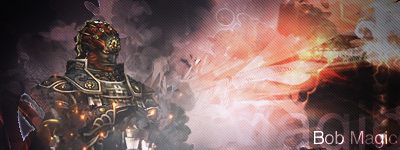
You really need to work on your text, an awesome sig with a worthless text will most likely equal an awful signature.
The first one: Skip the scanlines and learn how to blend your renders. And, work on the text. Download some fonts off dafont.com and have this in mind: Not all fonts works with all signatures. Find a font that would fit specifically for the piece you're making.
The second one looks good, but the scanlines... sigh... They're too worn out
Work on your text once again
I'll give you a total of 6/10, you have great potential
-
03-17-2009 #3
Member
- Reputation
- 93
- Join Date
- Apr 2007
- Posts
- 447
- Thanks G/R
- 0/0
- Trade Feedback
- 0 (0%)
- Mentioned
- 0 Post(s)
- Tagged
- 0 Thread(s)
Thanks for the tips, the first one is saved as a psd so the text and scanlines are easily removable.
Text is something i guess i need to learn any directions you can point me in as for text and blending renders?
-
03-18-2009 #4
 Active Member

- Reputation
- 19
- Join Date
- Mar 2009
- Posts
- 23
- Thanks G/R
- 0/0
- Trade Feedback
- 0 (0%)
- Mentioned
- 0 Post(s)
- Tagged
- 0 Thread(s)
It's not about blending the text, it's about choosing the correct font when arranging your sigs layout. Here is something I recommend doing:
>> Download and create a nice library of 2000+ fonts for yourself. What this means is accquire somewhere around 2000+ fonts load em into your main FONTS directory.
>> Now for font choosing tips:
1. Reload Photoshop to ensure it sees all the new fonts.
2. Next once you are at the final stages of your sig where you would most likely start choosing a font, type the text you desire in the 1st font you think you will like.
3. Copy that layer
4. Hide the original layer leaving the "Copy" version visible
5. Go through the fonts until you find the next one you like.
6. Rinse and repeat steps 3-5 until you have about 5-6 differnt versions of the text to go over.
7. Once you have this make sure only 1 layer of the text is ever visble at once then start to compare them one by one. Hide & unhide, move the text around etc.
This will help you narrow down and start to look at more than just your basic Arial/Tacoma/Verdana fonts.
 I make with the pretty and shiny
-
03-18-2009 #5
 Contributor

- Reputation
- 155
- Join Date
- Dec 2006
- Posts
- 359
- Thanks G/R
- 8/2
- Trade Feedback
- 1 (100%)
- Mentioned
- 0 Post(s)
- Tagged
- 0 Thread(s)

1st picture is way to big.
The 2nd is perfect size.
-
03-18-2009 #6
Active Member
- Reputation
- 32
- Join Date
- Nov 2008
- Posts
- 130
- Thanks G/R
- 0/0
- Trade Feedback
- 0 (0%)
- Mentioned
- 0 Post(s)
- Tagged
- 0 Thread(s)
Yea, I'll have to go with the second one. You seem to have been told what needs to be done. If you need fonts I have posted 500 fonts here for download:
http://www.mmowned.com/forums/graphi...500-fonts.html
..and yes, either one of those sigs would be better than Kanye West
"If Man realizes technology is within reach, he achieves it. Like it's damn near instinctive."
--Ghost in the Shell
-
03-18-2009 #7
Active Member
- Reputation
- 34
- Join Date
- Mar 2009
- Posts
- 192
- Thanks G/R
- 0/0
- Trade Feedback
- 0 (0%)
- Mentioned
- 0 Post(s)
- Tagged
- 0 Thread(s)

I like them
Goodjob!
-
03-18-2009 #8
Contributor
- Reputation
- 127
- Join Date
- Jun 2008
- Posts
- 1,324
- Thanks G/R
- 0/0
- Trade Feedback
- 0 (0%)
- Mentioned
- 0 Post(s)
- Tagged
- 0 Thread(s)
Looks cool to me
first to big tho ;P well nice work

----------------------------------------------------------------

-
03-19-2009 #9
Member

- Reputation
- 1
- Join Date
- Mar 2009
- Posts
- 53
- Thanks G/R
- 0/0
- Trade Feedback
- 0 (0%)
- Mentioned
- 0 Post(s)
- Tagged
- 0 Thread(s)
I always like when theres outgoing text from a sig, it looks special. :3
I'd use the second one.
@mitron
i love your sig *_*
Btw... why doesnt my ava show up? i remember uploading one...Last edited by DesertDarky; 03-19-2009 at 10:35 AM.
-
03-19-2009 #10
Member
- Reputation
- 1
- Join Date
- Mar 2009
- Posts
- 30
- Thanks G/R
- 0/0
- Trade Feedback
- 0 (0%)
- Mentioned
- 0 Post(s)
- Tagged
- 0 Thread(s)

I really like the second one, as for the first one, like everyone else said, the text is messing up the rest of the signature.


 Reply With Quote
Similar Threads
-
[showoff] A few sigs of mine !
By dubnasty in forum Art & Graphic DesignReplies: 4Last Post: 05-25-2009, 05:38 PM -
[Showoff] A Few of my random sigs. ;-)
By JonLeonTM in forum Art & Graphic DesignReplies: 3Last Post: 01-19-2009, 08:17 AM -
[Showoff] Few New Sigs
By aisha.wolfgang in forum Art & Graphic DesignReplies: 7Last Post: 10-25-2008, 01:24 AM -
[Showoff][Rate] First REAL Sig
By Sublimepwns_ in forum Art & Graphic DesignReplies: 4Last Post: 04-20-2008, 07:27 PM -
[Showoff/Rate] My newest sig
By Anarchy [RD] in forum Art & Graphic DesignReplies: 4Last Post: 03-22-2008, 04:01 PM
-
OwnedCore Forums
casino news World of Warcraft Pokemon GO MMO Overwatch RTS Casino reviews bc game bc game bc game bc game bc game bc game bc game bc game bc game bc game bc game bc game bc game bc game bc game bc game bc game bc game bc game bc game bc game bc game bc game bc game bc game bc game bc game bc game bc game bc game bc game bc game bc game bc game bc game bc game bc game bc game bc game bc game bc game bc game bc game bc game bc game bc game bc game bc game bc game bc game -
casino
Casino Gambling Online casinos Casino en ligne Jackpot City no deposit bonus codes roobet Casino reviews Bitcoin casino Paypal Casino Lucky8 1xbit heycasino Bitstarz Casino - No ✅Wildz Casino - 100% ✅Bitkingz Casino - ✅Royal Vegas Casino no ⭐ Bitstarz Casino - The Best Trusted Casinos ✅MyEmpire Casino - Découvrir l'élégance Casino de Deauville un -
CoreCoins
CoreCoins CoreCoins FAQ Shout-Out Banner Ads -
My OwnedCore
My Profile Notifications Settings Buy CoreCoins About Us


Privacy Policy | Cookie Policy | Terms | Contact Us
Available Payment Methods:-


-
Casino
Welcome Bonuses | Casino | Bonus code | Millionz | ZenCasino | No deposit bonus | Casino Bonus | Lucky31 | Oshi Casino | Betflip Casino | Jackpotcity | Bovada casino | Casino Reviews | Drake Casino | InstantPay | How to Play BlackJack Online | Casobet | BuzzLuck | NeedForSpin | Mystake Casino | PalmSlots Casino | Bitstarz | Stake Casino | MrGreen | Sportsbook | Dublinbet | Lucky Dreams Casino | BitCasino