![[Showoff/Rate] Angelina Jolie, New version!!!](https://www.ownedcore.com/forums/images/styles/OwnedCoreFX/addimg/menu4.svg)
Hey Guys,
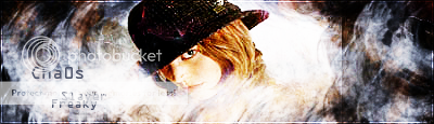
And finally here after some time I made a new signature.
Looking good at Tuts and trying some things out. I made this one.
I hope you guys like it, and please if you don't . Comment it, I take any critisism . But please remember I'm still in the beginner phase, trying stuff out etc.
Greetz,
*EDIT: a much better version uploaded with first time using C4Ds and some pen toolEnjoy!!!

![[Showoff/Rate] Angelina Jolie, New version!!!](https://www.ownedcore.com/forums/../images/ba/9/top-1.gif)
![[Showoff/Rate] Angelina Jolie, New version!!!](https://www.ownedcore.com/assets/mm/images/wits.png "TradeSafe Middleman")
![[Showoff/Rate] Angelina Jolie, New version!!!](https://www.ownedcore.com/forums/images/styles/OwnedCoreFX/addimg/wicc.png "CoreCoins")

Shout-Out
User Tag List
Results 1 to 12 of 12
-
08-25-2008 #1
 Member
- Reputation
- 12
- Join Date
- Oct 2007
- Posts
- 133
- Thanks G/R
- 0/0
- Trade Feedback
- 0 (0%)
- Mentioned
- 0 Post(s)
- Tagged
- 0 Thread(s)
[Showoff/Rate] Angelina Jolie, New version!!!
Last edited by FreakySlayer; 08-26-2008 at 02:26 AM.
![[Showoff/Rate] Angelina Jolie, New version!!!](https://www.ownedcore.com/images/ba/g/b2.gif)
-
08-25-2008 #2
Banned
- Reputation
- 179
- Join Date
- Jan 2008
- Posts
- 1,396
- Thanks G/R
- 0/0
- Trade Feedback
- 0 (0%)
- Mentioned
- 0 Post(s)
- Tagged
- 0 Thread(s)
Render is a bit squashed... needs some C4Ds, maybe make the tag bigger, and not alot of depth. Other than that good job and keep on improving.
-
08-25-2008 #3
Member
- Reputation
- 12
- Join Date
- Oct 2007
- Posts
- 133
- Thanks G/R
- 0/0
- Trade Feedback
- 0 (0%)
- Mentioned
- 0 Post(s)
- Tagged
- 0 Thread(s)
Hmm yeh just saw about the squashed signature. Shall upload a better version ASAP.
What do you think I should do about the depth then?
And shall try some C4D but I'm still beginner. Thanks for your comment though
-
08-25-2008 #4
Member
- Reputation
- 23
- Join Date
- May 2008
- Posts
- 133
- Thanks G/R
- 0/0
- Trade Feedback
- 0 (0%)
- Mentioned
- 0 Post(s)
- Tagged
- 0 Thread(s)
Use a big soft white round (default basic ones) brush for a light source on the top left part of her body, since that is where the light is coming from, then get a dark brush, lower the opacity and make some shadows, play around until you get good lighting and that will go a long way to add depth, apart from that the render could be a little more depth, and the c4ds could be changed (think blending layer) Hope this helps ya

-
08-25-2008 #5
Banned
- Reputation
- 179
- Join Date
- Jan 2008
- Posts
- 1,396
- Thanks G/R
- 0/0
- Trade Feedback
- 0 (0%)
- Mentioned
- 0 Post(s)
- Tagged
- 0 Thread(s)
To add depth I usually blur the background in certain points and sharpen the focal
-
08-25-2008 #6
Member
- Reputation
- 12
- Join Date
- Oct 2007
- Posts
- 133
- Thanks G/R
- 0/0
- Trade Feedback
- 0 (0%)
- Mentioned
- 0 Post(s)
- Tagged
- 0 Thread(s)
Ok thanks for the comments, although it was my first time using C4Ds and pen tool, I go follow your advice for future sigs. Thanks
-
08-25-2008 #7
Banned
- Reputation
- 365
- Join Date
- Aug 2007
- Posts
- 1,725
- Thanks G/R
- 0/0
- Trade Feedback
- 0 (0%)
- Mentioned
- 0 Post(s)
- Tagged
- 0 Thread(s)
i think you should have erased more of the c4d's and less pen tooling, but the pen tooling itself is nice and well done ( some edges, though)
I see the Lightsorce behind her, but it doesn't overlay her, you could have added more depth here, also the render doesn't blend so good on the right side (its a little squashed and choppy, isn't it?)
Bigger sigs is the answer, try 400*150, its alot easier.
Text: Gradient overlay >_<
Makes the text stand out too much, and in combination with the outerglow its too bright, i prefer(sure you noticed^^) plain white/black text.
sorry for any grammar/spelling mistakes, wrote that quite quickly g2g now ^_°
oh, and add depth by better light/shadows (set a white/black brush on overlay ~50%)
-
08-25-2008 #8
Member
- Reputation
- 23
- Join Date
- May 2008
- Posts
- 133
- Thanks G/R
- 0/0
- Trade Feedback
- 0 (0%)
- Mentioned
- 0 Post(s)
- Tagged
- 0 Thread(s)
Soft light and a slightly higher opacity is usally better for lightingOriginally Posted by Narudan
-
08-25-2008 #9
Member
- Reputation
- 17
- Join Date
- Jun 2008
- Posts
- 162
- Thanks G/R
- 0/0
- Trade Feedback
- 0 (0%)
- Mentioned
- 0 Post(s)
- Tagged
- 0 Thread(s)


I believe you wrap the link in [img][/img] to show it here

I think it looks good for a beginner and I was pretty much like you when I began
Call me zak
-
08-26-2008 #10
Member
- Reputation
- 12
- Join Date
- Oct 2007
- Posts
- 133
- Thanks G/R
- 0/0
- Trade Feedback
- 0 (0%)
- Mentioned
- 0 Post(s)
- Tagged
- 0 Thread(s)
Thanks for the comments, will try some more depth and aded the [IMG] tags.
Greetz,
-
08-26-2008 #11
Banned
- Reputation
- 365
- Join Date
- Aug 2007
- Posts
- 1,725
- Thanks G/R
- 0/0
- Trade Feedback
- 0 (0%)
- Mentioned
- 0 Post(s)
- Tagged
- 0 Thread(s)
I don't like Soft light because it kind of changes the original color, i usually use one 200px brush on overlay and over that an ~150px brush as a lightsource (ofc main part of the brush isn't in the image)Originally Posted by novaprosp3kt
-
08-26-2008 #12
 King - AMG

- Reputation
- 415
- Join Date
- Aug 2008
- Posts
- 812
- Thanks G/R
- 1/2
- Trade Feedback
- 0 (0%)
- Mentioned
- 0 Post(s)
- Tagged
- 0 Thread(s)
Oh
Shes not naked
Nice sig though


 Reply With Quote
Similar Threads
-
[Showoff/Rate] New Signature. Help Choose
By Maine in forum Art & Graphic DesignReplies: 17Last Post: 09-03-2008, 07:47 AM -
[Showoff + Rate] Something New
By Maine in forum Art & Graphic DesignReplies: 6Last Post: 08-08-2008, 11:48 AM -
[showoff/rate] My new sig
By Joetherogue in forum Art & Graphic DesignReplies: 2Last Post: 06-17-2008, 08:18 PM -
[Showoff/rate]A new sig
By Lord-kapser in forum Art & Graphic DesignReplies: 3Last Post: 06-04-2008, 11:10 AM -
[Showoff/Rate] My new sig :)
By Eagleshadow in forum Art & Graphic DesignReplies: 1Last Post: 05-04-2008, 10:28 PM
-
OwnedCore Forums
casino news World of Warcraft Pokemon GO MMO Overwatch RTS Casino reviews www.planet-casino.com no deposit codes bc game bc game -
casino
Casino Gambling Online casinos Casino en ligne bc game bc game bc game no deposit bonus codes roobet Top 10 Casinos Casino reviews Bitcoin casino Paypal Casino Lucky8 1xbit heycasino Lucky31 Casino Bonus - ⭐ Lucky8 Bonus sans ✅BC GAME casino - ✅Sparky and Shortz ✅AllSlots Casino Bonus ✅Casinos en ligne - BlackJack Casino Rules - Why Stake is a High Crypto Casino Bonuses: -
CoreCoins
CoreCoins CoreCoins FAQ Shout-Out Banner Ads -
My OwnedCore
My Profile Notifications Settings Buy CoreCoins About Us


Privacy Policy | Cookie Policy | Terms | Contact Us
Available Payment Methods:-
![[Showoff/Rate] Angelina Jolie, New version!!!](https://www.ownedcore.com/images/paybutton/paypal.png)
![[Showoff/Rate] Angelina Jolie, New version!!!](https://www.ownedcore.com/images/paybutton/skrill.png)
![[Showoff/Rate] Angelina Jolie, New version!!!](https://www.ownedcore.com/images/paybutton/payop.png)
-
Casino
bcgame | casino | casino | casino | casino | casino | casino | casino | casino | casino | casino | casino | casino | casino | bcgame | casino | casino | Stake | casino | casino | Stake | casino | casino | casino | casino | Stake | stake | casino | casino | casino | casino | casino | casino | casino | casino | casino | casino | casino | casino | casino | casino | bcgame | casino | casino | Stake | casino | casino | casino | casino | casino | casino | casino | casino | casino | casino | casino | casino | bcgame | casino | casino