![[Showoff][Rate] Second REAL Sig](https://www.ownedcore.com/forums/images/styles/OwnedCoreFX/addimg/menu4.svg)
Please Leave A Comment And Rate.

![[Showoff][Rate] Second REAL Sig](https://www.ownedcore.com/forums/./ocpbanners/1/2/9/8/0/2/2/01d9781faec8bfe3abf9095ac9e57d1e.jpg)
![[Showoff][Rate] Second REAL Sig](https://www.ownedcore.com/assets/mm/images/wits.png "TradeSafe Middleman")
![[Showoff][Rate] Second REAL Sig](https://www.ownedcore.com/forums/images/styles/OwnedCoreFX/addimg/wicc.png "CoreCoins")

Shout-Out
User Tag List
Thread: [Showoff][Rate] Second REAL Sig
Results 1 to 4 of 4
-
04-20-2008 #1
 Member
- Reputation
- 57
- Join Date
- Apr 2008
- Posts
- 344
- Thanks G/R
- 0/0
- Trade Feedback
- 0 (0%)
- Mentioned
- 0 Post(s)
- Tagged
- 0 Thread(s)
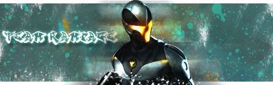
[Showoff][Rate] Second REAL Sig
:Swift Leveling: <Cheap Swift Power Leveling>
https://swiftleveling.webs.com/
![[Showoff][Rate] Second REAL Sig](https://www.ownedcore.com/images/ba/g/b2.gif)
-
04-20-2008 #2
Contributor

- Reputation
- 184
- Join Date
- Sep 2006
- Posts
- 459
- Thanks G/R
- 0/0
- Trade Feedback
- 0 (0%)
- Mentioned
- 0 Post(s)
- Tagged
- 0 Thread(s)
ALOT better than your first one. Keep um up
Out of the top proffesional sigs, id say a 7.5/20
Rate my sig, its like 2 posts below
-
04-21-2008 #3
Contributor
- Reputation
- 196
- Join Date
- Mar 2007
- Posts
- 960
- Thanks G/R
- 0/0
- Trade Feedback
- 0 (0%)
- Mentioned
- 0 Post(s)
- Tagged
- 0 Thread(s)
Out of the top professional sigs? some pro sigs are INSANE!Originally Posted by hordenight826
anyways, it is an improvement on your other sig. i think it lacks colour as the background is just the one colour. the render doesn't really blend in so much because it is darker than the background. with the text, don't just choose one that looks cool or is your favourite font, it doesn't fit in with the sig. the splatters i'm not really fond of, they stand out too much imo.

-
04-21-2008 #4
Member
- Reputation
- 57
- Join Date
- Apr 2008
- Posts
- 344
- Thanks G/R
- 0/0
- Trade Feedback
- 0 (0%)
- Mentioned
- 0 Post(s)
- Tagged
- 0 Thread(s)
Grafiti is sometimes done with spray PAINT PAINT Splaters are in the pic i think it has something to do with it... thanks for your opinion though
Last edited by Sublimepwns_; 04-22-2008 at 11:48 AM.
:Swift Leveling: <Cheap Swift Power Leveling>
https://swiftleveling.webs.com/

 Reply With Quote
Similar Threads
-
[Showoff/rate]A new sig
By Lord-kapser in forum Art & Graphic DesignReplies: 3Last Post: 06-04-2008, 11:10 AM -
[Showoff] My first "real" sig
By Pikkunaama in forum Art & Graphic DesignReplies: 2Last Post: 05-11-2008, 03:02 PM -
[Showoff/Rate] My new sig :)
By Eagleshadow in forum Art & Graphic DesignReplies: 1Last Post: 05-04-2008, 10:28 PM -
[Showoff][Rate] First REAL Sig
By Sublimepwns_ in forum Art & Graphic DesignReplies: 4Last Post: 04-20-2008, 07:27 PM -
[Showoff/Rate] My newest sig
By Anarchy [RD] in forum Art & Graphic DesignReplies: 4Last Post: 03-22-2008, 04:01 PM
-
OwnedCore Forums
casino news World of Warcraft Pokemon GO MMO Overwatch RTS Casino reviews bc game bc game bc game bc game bc game bc game bc game bc game bc game bc game bc game bc game bc game bc game bc game bc game bc game bc game bc game bc game bc game bc game bc game bc game bc game bc game bc game bc game bc game bc game bc game bc game bc game bc game bc game bc game bc game bc game bc game bc game bc game bc game bc game bc game bc game bc game bc game bc game bc game bc game -
casino
Casino Gambling Online casinos Casino en ligne Jackpot City no deposit bonus codes roobet Casino reviews Bitcoin casino Paypal Casino Lucky8 1xbit heycasino GoldenBet Casino- 100% CashLib dans les casinos Top 10 Bitcoin Online Top 10 Slots Machine on Neteller Casino Cresus Casino Bonus - ✅Unibet Casino - Best ✅Madame Destiny ⭐ BC GAME Bonus sans -
CoreCoins
CoreCoins CoreCoins FAQ Shout-Out Banner Ads -
My OwnedCore
My Profile Notifications Settings Buy CoreCoins About Us


Privacy Policy | Cookie Policy | Terms | Contact Us
Available Payment Methods:-
![[Showoff][Rate] Second REAL Sig](https://www.ownedcore.com/images/paybutton/paypal.png)
![[Showoff][Rate] Second REAL Sig](https://www.ownedcore.com/images/paybutton/skrill.png)
![[Showoff][Rate] Second REAL Sig](https://www.ownedcore.com/images/paybutton/payop.png)
-
Casino
Drake Casino | BitCasino | Casobet | Dublinbet | Millionz | PalmSlots Casino | Lucky8 | Bovada casino | USA CASINO | Casino | BuzzLuck | MrGreen | Crypto Casino | Betflip Casino | Oshi Casino | ZenCasino | Casino Bonus | Slot machines | NeedForSpin | Bc Game | Lucky31 | No deposit bonus | Welcome Bonuses | Casino Reviews | InstantPay | How to Play BlackJack Online | Stake Casino | Rollino Casino